- 29 Sci Bowl/Club- Tyler
- 30-31 Drill Squad- Danielle
- 32 Speech- Kaylie
- 33 MS Spelling Bee- Casey
- 34 Gnimocemoh- Danielle
- 35 HSBB Cheer- Christian
- 36-37 HS Girls BB- Kayla
- 38-39 HS Boys BB- Tyler
- 40 MS GBB- Kayla & Kaylie
- 41 MS BBB- Austin
- 42 MS BB Cheer- Casey
- 44 Voice- Austin
- 45 Archive- Christian
Pages
Friday, November 20, 2009
Winter Page Assignments
Wednesday, October 28, 2009
Web Design
- Quick Check Questions 2-4, 6-7 on pg 209 (4.2)
- Quick Check Questions 1-4, on pg 230 (4.3)
Tuesday, October 20, 2009
Sub Lessons for Wed. Oct. 21
- What two questions does choosing a "Basic Unit" answer when beginning a new drawing?
- Complete the sentence from the chapter- "This Basic Unit becomes the key that unlocks all of the _______________ within a chosen composition: All _______________ are found by comparing everything to the _______________."
- In your own words, try to define a "Basic Unit" and explain it's importance.
- On page 124, Dr. Edwards refers back to chapter 6 when she compares any realistic drawing to a child's jigsaw puzzle. Mr. Mallory has talked about how perceiving negative space shapes and using a "picture frame" has three major parts to that puzzle. What are those three major parts that make up any composition?
- A basic unit can be a positive shape, a negative shape, or even just a single edge from point to point. Once chosen, what are determined relative to that Basic Unit?
- In your own words, what is meant by "proportion?"
- Initially finding and using a Basic Unit may seem forced, mechanical, maybe even a little left-brained, but eventually, what happens for artists, as demonstrated by the story about Matisse on p125?
- What kinds of things does using a Basic Unit prevent?
- Draw as realistic of a self-portrait as you can. Just your face, fill most of a page.
- Draw yourself as a cartoon character. You can be funny or serious, an animal or a superhero- just so long as you're a cartoon.
- Create a trade mark logo for yourself, like the Nike swoosh, the Verizon check mark, the McDonald's M, the Pepsi ying-yang, or the iPod's apple. What symbols represent you?
- Create a design using some of your favorite shapes and colors. Are you rectangular, rounded and circular, sharp and triangular? Edgy and rough? Sleek and smooth? Just make some random designs, maybe even a maze, but use lines, shapes, colors, or textures that say something about you.
Wednesday, October 14, 2009
Example of a differentiated Lesson
Gauging student skills and abilities
Hands and faces are intricate and unique subjects, therefore they are good challenges for drawing students. At the beginning of the semester, I have students complete a series of pre-instructional drawings, sort of like pretests. One of which is ha hand, another is a chair and one is a face. During the course of the semester then, a more serious, substantial drawing of each of these subjects eventually serves as sort of a benchmark for each student's progress.
Toward the end of the first quarter I've been able to determine the ability level of my students from previous assignments in their sketchbooks as well as a number of other activities. On assessment I took this year was a Left/Right brain inventory survey, which allegedly can determine if students have an inclination toward particular thinking modes which would allow them to perceive visually more easily, or with more difficulty.
Direct Instruction
To begin the unit I give students an analogy for drawing from real life- simultaneously observing and recording those observations, I ask them to imagine a microscopic explorer traveling the terrain that is their subject (a hand, face, or still life object). Then I demonstrate the technique of blind contour drawing on the board.
Basically, for "contour drawing," you pick a point on the object where the eye can begin its slow journey around the contour or edge of the object. The eye is barely crawling as it begins its journey. When the eye begins to move, so should the hand holding the pencil. At no time should you look at your hand as it draws. Students try drawing the entire contour of the object without lifting your pencil form the paper. Part of the point of the exercise is to develop the student's perception of edges, "contours," or borders between shapes, AKA lines.
Next, students are asked to complete a series of blind contour drawings in their sketchbooks. First with the help of a paper bag to keep them from looking at their paper. Then, gradually the amount of time spent drawing increases and they are challenged to draw "blind" without the bag.
One step might be considered to incorporate cooperative , because instead of hands or shoes, students are asked to take turns modeling for each other, so that they can draw blind-contours of faces.
Information Processing/Discussion
Along the way we debrief. Sometimes one-on-one with each student, sometimes in small groups, and a few times as an entire class, discussing how their drawings are accurate records of their perceptions, not necessarily perfect representations of their hands (or shoes or faces). We discuss and try to evaluate both the process and the products. One of the things that is important is to have the students reflect on how the process felt. If they were focused, able to avoid distractions, "absorbed" so to speak, and lost track of time, felt relaxed yet alert, or generally became silent or wordless (both outwardly and better yet, in their own minds) then, hopefully they can recreate those feelings each time they attempt a drawing. This hones their perceptual skills, stretches their attention-spans, and ideally, shifts them from a typically verbal to a more visual/spacial cognitive mode which is beneficial to being able to draw accurately.
Once students have improved their blind-contour skills enough, we add back in the "check-back" or "modified" contour drawing, where students try to look at the subject more than at their paper, but are now allowed to check back periodically in order to correct for placement and proportions. Students are then given viewfinders and introduced to the concepts of selecting a composition within a format (picture frame) and the practice of some artists of imagining that whatever they are viewing is flattened onto a single surface (the picture plane). Finally, they are asked to tone a format on a page, pose their hands with the viewfinder, and spend a few days drawing a fully developed, realistic drawing of their hands.
Assessment and Evaluation of Student Progress
When their drawings are finished, students are given a rubric to score themselves on each of the 5 perceptual skills; edge, space, proportion, shading, and composition as well as on their effort and level of improvement. They are also asked to respond to a number of reflection questions. Later I score them on the same categories, and usually try to read and comment on their reflections.
Students also view all of the drawings in the class and discuss the accuracy of the contour drawings and how convincing the shading is and analyze the compositions. Students are asked to consider the sensual, formal, expressive, and technical qualities of each others drawings during this "critique session."
So the rubric may be a formal summative assessment, the critique session is more informal, and all along the way there have been deliberate as well as incidental informal formative assesments going on. In this way, even if a given student does not achieve the desired technical proficiency, their perceptual skills may still grow and/or they may acquire an understanding of the concepts of contour, modeling shading, and arranging/selecting composition.
Tuesday, October 13, 2009
Formal Writing Project; Professional Web Planning and Proposal
Turn in each steps on the deadlines listed below but save your work because you will turn it all in together in a presentation folder at the end as your Formal writing project.
Here is a list of steps and deadlines:
First the Purpose
- List of site goals (p.49 in DRM Tutorial 2 hand-out) Due Oct. 7
- Target Audience (p.51) Due Oct. 8
- Information Gathering (p.53)
- Explore examples/"competition" (p.55)
- End-User Scenario (p55) Steps 3-5 Due Oct. 12
- Session 2.1 Quick Check Questions (p56) Due Oct 13
- Outline (p.57) Due Oct 14
- Flowchart (p58) Also Due Oct 14
- Concept & Metaphor (p.60) Due Oct 15
- Color Scheme (p.64) Due Oct 16
- Quiz over DRM Tut 2 Vocab on Fri Oct 16
- We will resume working in the HTML/HXTML book on Mon. Oct 19 with Tutorial 4; Designing with tables, but Proposal steps will continue to be due
- 5. Font Choices (p.66) Due Oct 19
- 6. Graphics (p.67) Due Oct 20
- 7. Layout Sketch (p.69) Due Oct 21
- 8. DRM Tutorial 2 Session 2.2 Quick Check Questions (p.69) Due Oct. 22
Professional Proposal Terms
- accessibility
- additive color system
- client
- end-user scenario
- flowchart
- font
- font color
- font size
- font style
- generic font families
- hexadecimal color code
- information architecture
- layout
- market research
- metaphor
- monospaced font
- navigation system
- proportional font
- RGB system
- sans-serif typeface
- serif typeface
- site concept
- subtractive color system
- target audience
- user profile
- Web Safe Color Palette
Thursday, October 1, 2009
Tutorial 3; Color and Fonts
- Session 3.1 Quick Check questions 1-9 due Wednesday Sept. 30
- Session 3.2 QC questions 3, 4, & 5
- AND Session 3.3 QC questions 3, 4, & 5 due Friday Oct. 2
- Tutorial 3; Arcadium Web site due Thurs Oct. 8
- Tutorial 3 Test, Friday Oct. 9
Child Drawing Developmental Stages
- Scribbling (AGE 1 1/2)
- Symbols Begin (2-3)
- Adding Details (3-4)
- Telling Stories (4-5)
- Landscapes (5-6) Composition/Principles reign
- Complexity builds (Grades 5-7)
- Gender Differentiated
- Desperately Seeking Realism (ages 10-11) Details/Elements reign, at the expense of good composition.
Wednesday, September 16, 2009
Fall Production assignments
- All 4 Spirit Week dress-up days
click here to see list - One framed subject
- Odd angle
- Them :"ONE in every crowd"
- Decorating Fri 9/18
- Coronation Sun 9/20
- Jersey Auction 9/20
- Pep Rally Fri 9/25
- Parade Fri 9/25
- 5 Softball/Baseball-
- Talent Search- Tyler
- Stu Govt.- Tyler
- NHS/FCCLA- Cody
- 10-11 Homecoming- Kaylie
- 12-13 Homecoming- Christian
- 14 Fall Cheer- Austin
- 15- Cross Country- Austin
- 16-17 Football- Christine
- 18-19 Volleyball- Kayla
- 20 MS Football- Casey
- 21 MS Cheer- Danielle
- 22 MS Volleyball- Christian
- 23 MS Cross Country- Casey
Picasso/Stravinsky Drawing Reflection Questions
- What were at least 3 conditions that we used to help reduce the conflict between brain hemispheres, so that your left-mode would give up and allow your right-mode to dominate the work load for this drawing?
- Try to remember how you felt when you first began this drawing- can you describe those feelings? Why do you think you felt that way?
- How did it feel by the end of the drawing, once you were caught-up in it?
- Why do you think you were required to draw Stravinsky Upside-Down? Do you think that made it easier or more difficult?
- At what point do you think you may have made the shift from left to right? What did it feel like? Do you think you'll recognize it if it happens again?
- What was the easiest/funnest part to draw?
- What was the most difficult/least fun?
- What about your finished product are you most pleased with?
- What are you least pleased with?
Friday, September 11, 2009
Practice Pages on yearbookavenue
Practice Pages is one new feature that you will find particularly helpful this time of year as you train your staff members. Here is how it works:
- Go to Page Designer under the Create menu
- Go to File/New Practice page. Enter a name for your page and save.
- A double page spread will open and you can utilize all of the tools on the site to practice page design and experiment with different photo and text effects.
- You can access saved practice pages by selecting the Designs tab in the right navigation. Click on Custom and then select Practice Pages in the drop down menu.
- If you want to use a practice page design in your book, just drag and drop it onto a page.
Wednesday, September 9, 2009
Production
- Read pp.50-55, &86-91 taking notes as you go on the "Production" and "Photography 1" modules
- Use the "Activity 14.3" and "Quiz 14" handout as a study guide for the Photography 1 module, due Fri 9/11
- Quiz on Monday 9/14
- Don't forget to keep working on those photo event, pre-order sales, ad sales, and old book sales grades- just because they're quarter-long, don't put them off till mid October!
Tutorial 1 assignments
- Sessions 1.2 & 1.3 (Chemistry Teacher's web page) due by end of class Fri. 9/11
- 'Quick Check' questions on page 43 due Mon. 9/14
- Quiz over terms on pp. 43-44 will be Wed. 9/16
Friday, September 4, 2009
Signature Self-Portraits


Handwriting can be considered as a form of expressive drawing. After all, it consists primarily of the most fundamental element of design, line. Our signatures are shaped by our cultural influences in our lives, just like any work created by any artist.
After learning about the character and style possibilities of line, and a little bit about handwriting analysis, we created self-portraits using only signatures.
Ceramics Vocab- QUIZ TUES SEP4
- Bat- a flat disc made of plaster or wood which affixes to a pottery wheel. Works like a plate or tray for working with clay on.
- Bisque- Pottery which has been fired once, without being glazed yet.
- Bone Dry- Completely air-dried and ready to be fired in a kiln safely
- Clay- Alumina + Silica (powdered stone aka "feldspar") and water
- Plastic- Capable of being molded or modeled
- Plasticine- A plastic paste used for models and sculptures; an oil-based modeling clay
- Medium- a means of transmission, a liquid which carries or suspends something- oil or water
- Working- Sqiushing clay in your hand to make it warmer
- Form- Any 3-Dimensional shape, which has height, width, and depth
- Paul Cezane- French painter who suggested that the visual world is made up of 5 basic forms; cubes, spheres, forms, pyramids, and cones
Thursday, September 3, 2009
Tuesday, September 1, 2009
Your Second Web Page
- A link to the first Web page you created. You will have to use what's called an "absolute path"
{a href="\Fouts\WEB 1\Fouts_holli.html"}
An absolute path means that you direct browsers through the correct files to the specific document. - A link to a document withing your website (I will put a PDF for you to use)
- A graphic (also in your folders for you)
- Each of the following formatting styles: bold, big, small, italics, strike through, underline, super-script, and sub-script.
- At least one horizontal rule
- Headings 1, 2, and 3
Thursday, August 27, 2009
Assignments this week
- Signature Self Portrait, Due Monday, Aug. 31
- Write comments on each of your 5 Pre-Instructional Drawings, Also due Mon. 8/31
Product/Noun- Finished Drawing
- What are you most proud of about it?
- What are you most disappointed about with?
Process/Verb- When you were drawing, the act of drawing it - What did you enjoy drawing this one?
- What was the most difficult?
Packaging contest
You can draw on an existing package or download a template online. Deadline: November 30
Tuesday, August 25, 2009
Fall Sports Photo Grades
- 10 different sports teams including both ms & hs
- at least 66 sporting events
- 10 Yearbook staff members
Mr. Mallory can easily take Football and Cheer, but we need Volleyball, MS Volleyball, XC and Drill. You can certainly turn in pictures of practices as well and if you take pictures at 3 or more events, anything beyond the first two will be extra-credit.
Sports include:
- Varsity Football
- 9/JV Football
- MS Football
- Varsity Volleyball
- 9/JV Volleyball
- HS Cross Country
- MS Cross Country
- Fall Varsity Cheerleading
- Fall MS Cheerleading
- Drill Squad
It would be better if you took these pictures yourself, however, if you have difficulty with scheduling conflicts, parental permission, or transportation issues- you may ask someone to take the pictures for you. Please let us know who they are so that we can give you grade credit, but give them credit for any pictures used in the yearbook, Voice, Reporter, or school website.
There will be similar yearbook sports-photo assignments each quarter as part of your grade so that we can get pictures from other seasons.
Saturday, August 22, 2009
Good quote for teachers
Friday, August 21, 2009
Pre-Instructional Drawings
- A realistic face, from memory or imagination -Due 8/20
- A chair- from real life -Due 8/21
- A face, from real life -Due 8/24
- A whole person (as much as you can fit on the page), also from real life -Due 8/24
- Your self-portrait -Draw in class on Mon 8/24
Thursday, August 20, 2009
Ad/Book Sales Grade Component
- 4 Ads = A
- 3 Ads = B
- 2 Ads = C
- 1 Ad = D
- 0 Ads = F
Jan-May 2010 Pre-Orders $39
- A= 9-10 book orders
- B= 7-8
- C= 5-6
- D= 3-4
2007-08 $36
2006-07, 2005-06 $30
1978-2005 $25 (While supplies last)
- A= 7-8 book sold
- B= 5-6
- C= 3-4
- D= 1-2
Announcemtents
The following people ordered theirs last year and need to pick it up:
Jared Fraizier, Chaise Fraizier, Nicholas Gambs, Shelby Houston, Mallory Mitchell, Mitch Putnam, Nick Putnam, and Robert Steele.
It's never to early to order your 2009-10 yearbook, order before Christmas to get them for $36. They'll go up to $39 after that and this time if you don't order them ahead of time they'll be $42.
See Mr. Mallory for an order form, look for the link on the school website, http://www.boyer-valley.k12.ia.us or visit http://shop.jostens.com to order one online.
7th and 8th graders interested in MS Cheerleading see Mr. Mallory 7th hour on Monday 8/24. There are twice as many home football games this year so it should be fun!
Tuesday, August 18, 2009
Josten's PhotoShare
Get your pictures in the yearbook! The Yearbook Staff invites students and parents to submit photos for the yearbook. If you've got great photos of school and community events or you and your friends just having fun, we'd like to see them. Our photographers can't be everywhere. Help us get as many photos as possible to create a terrific book everyone will want to have.
Here is how you can submit photos online:
• Go to: https://images.jostens.com/
• If it does not automatically log you into the site, enter username:400002441 and password:dogs
• Browse to select the photo(s) you wish to upload.
• Enter information about the photo and provide contact information in case the staff needs additional information.
• Click "Save Details".
It's that easy! Submit your photos today! The last day to submit photos is 5/21/2010.
Thank you, and enjoy the rest of the school year!
Sincerely,
Yearbook Adviser and the 2010 Yearbook Staff.
The Yearbook Staff will review all photos and determine final yearbook content. We cannot guarantee that all submissions can be used in the book.
Saturday, June 27, 2009
Line Rider; Online Drawing Game

http://linerider.com
One of the tricks I try to use to help my students learn to draw is to have them imagine they're flea-sized astronauts hiking along an alien terrain, while looking at an object or a model and concentrating on it's edges, and simultaneously record the contours as they observe them.
I just saw this website featured on a McDonald's commercial of all things. It is really fun and their sledder is a lot like my flea.
Watch one of their movies first to learn how to do it first.
I think every high school drawing student should try it to improve your perception of edges and contours! Have fun, but beware, it's addictive.
Sunday, June 14, 2009
Easy Scribble
Visualize your paper with a continuous line that wanders over the paper in every possible direction. You may call it scribbling if you like. Move your pen in the air over the paper without touching it, as if you were making these lines with ease and confidence. See the page well scribbled in your mind's eye.
Now actually make the lines you just visualized. Pay attention that you don't change your hold on your pen. Keep your drawing hand and arm off the paper. Your arm moves freely guiding the pen.
It is not necessary to make any pattern or to organize your scribbles. Just relax and fill up the page with every conceivable movement you can invent. Have fun. When the page is fairly dense with lines, stop.
Later, when you begin to draw subjects, continue to hold and move your pen or pencil in the same easy, free way.
Your Goals and Strategies
Design your outcomes. While you are writing goals, you may want to list other goals that don't have anything to do with drawing. Once you know what your goals are, you can decide what you need to do to reach them- what you need to change, what you need to learn, and what you need to unlearn.
The next step in building your foundation is to write down all the strategies that occur to you. What do you think you need to do to be able to draw the way you want to? For example, you might write:
- I must learn to see better
- I need to relax and let go
- I have to learn techniques
- I need some lessons
Reasons you CAN draw
"Attitude is always more important than aptitude. With the right attitude you will be committed to your task and success will be assured." ~Robert Dvorak
Take all the reasons you THINK you cannot draw the way you would like to, and rewrite them in your sketchbook as statements that serve your purpose- learning to draw, or to draw with greater skill, spontaneity, etc. It is not necessary that you actually believe what you write. Just do the exercise and be aware of how it feels.
Here are some examples of reasons listed, then listed as POSITIVE statements.
- NEG- I don't have any talent.
- POS+ I can learn to draw whether I think I have talent or not.
- NEG- When it comes to drawing, I'm just no good.
- POS+ When it comes to drawing, I can become good.
- NEG- My brother/sister is the one who's good at it in our family.
- POS- My brother/sister was always good at it. Now I can be an artist in the family too.
- NEG- It never comes out the way I want it to.
- POS+ I can alwyay accept the way it comes out, because that was my experience at that time.
Benefit List
- What can drawing do for me?
- What can drawing change for me?
- How am I going to be able to use drawing?
- What can drawing teach me?
- How can drawing help me grow?
Here is a list of possible benefits from artist Robert Dvorak's book 'Experiential Drawing:'
- develops concentration skills
- increases perception and awareness
- means of expression
- mode of communication
- helps you discover your creativity
- relaxing and energizing process
- develop ability to imagine and create
- satisfaction from sense of accomplishment
- & therefore, increased self-esteem
Monday, June 8, 2009
Book suggestion
My review
rating: 5 of 5 stars
INTERESTING, A lot of the same concepts as Drawing on the Right Side of the Brain, but a lot less technical. Much easier to read and tons of really practical exercises for people first learning to draw. Think I'll use a lot of this to supplement or even replace a lot of what I teach already. I definitely recommend this to anyone who'd like to try to teach themselves to draw. I think it may be out of print, so you'll have to order a used copy, but what the heck, that's usually cheaper. Good stuff. I've been teaching Drawing for 16+ years now and been seeking out and/or reading books on drawing for a lot longer than that and this is the first one that I like nearly as much as Drawing on the Right Side- WHAT A FIND!
View all my reviews.
Book Report
My review
rating: 5 of 5 stars
That was fun. All the existential angst of Zen and the art of Motorcycle Maintenance, but none of the tedious Buddhist calm or the superior Hippie moralizing. This was fast, fun, absurdist, apocalyptic romp.
The "King of New York" (island of death), who happens to be the last President of the United States regales us with his tales of the decline and fall of Western civilization, the technological and spiritual transcendence of the Chinese, and the development of the "Church of Jesus Christ, Kidnapped."
Now back to the gentle pace of Zen and Motorcycles.
View all my reviews.
Friday, June 5, 2009
Senior Portrait Specifications for the Yearbook
Here are some pretty good area photographers that you might want to look into-
- Brass Shutter in Denison 263-4321
- Chelle's Creative Photo in Woodbine 647-2101 www.chellesphotos.com
- Debbies in Dow City 643-5472 www.debbiesphoto.com
- Everlasting Portraits in Mapleton 882-1160 www.everlastingportraitstudio.com
- Fiahston Photography in Moorhead 886-5606
- Portraits by Hope in Dow City 263-8882 www.portraitsbyhope.com
And if you absolutely can't afford anybody else, and you don't mind only getting a CD and having to print your own, there's always me- "mal•com" (Mr. Mallory) http://mal-com.blogspot.com But know ahead of time that my availability depends on my schedule and prior family commitments.
While most major photography studios in the area already have these specifications, please have your photographer make a print that matches the following:
► Head-and-shoulder shots only
► No full body, no props
► Plain backgrounds preferred, indoor shots preferred
► Photo size: 1 ¾ inches tall by 1 ½ inches wide
► Photos must be vertical
► Head size from top of head to chin: 1 inch maximum
► COLOR photos, please. No black and white.
► Pictures turn out better if they are submitted digitally rather than our having to scan a print. If your photographer will submit photos digitally they must be 120% size at 300 ppi. They can be submitted on CD, DVD, on USB flashdrive or online. Please e-mail pictures to malloryt@boyer-valley.k12.ia.us.(This will work if you take your own too).
► If you or your child chose not to have a local photo studio take their portrait or can not afford to, either Mr. Mallory, the Yearbook Advisor or Mrs. Hanigan, the Student Newspaper Advisor, are available to take a simple "head shot" for the yearbook.
Tuesday, May 26, 2009
Yearbook Camp
Jostens Summer Workshop
For Colleen Arneson's Schools
Monday July 13th
Atlantic High School
Atlantic, IA
Open/Download a PDF of the camp flier
Please contact Mr. Mallory Before June 20 if you're interested in attending
Only $25, make checks payable to "Colleen Arenson"
This workshop will focus on using Jostens' Yeartech system online
Anyone interested in taking Yearbook I or Yearbook II either semester should attend this "camp."
For more info contact Colleen at
712-243-4143 or click here to e-mail her.
Monday, May 25, 2009
Example of a Photo-Essay
Saturday, May 23, 2009
Yearbook Workshop
Jostens Summer Workshop
For Colleen Arneson's Schools
Monday July 13th and Tuesday
July 14th
Atlantic High School
Atlantic, IA
Our different sessions are
New Adviser/Journalism
Yeartech Online
Yeartech/InDesign
For more info contact Colleen at
712-243-4143 or click here to e-mail her.
Monday, May 11, 2009
Art Finals; Post Tests
- Thurs Ma7 14- Yearbook
- Friday May 15- Portfolios Due for both Photography & Ceramics
- Wednesday May 20- Ceramics and Painting
- Thurs May 21- Photography
- Fri May 22- Final Painting Due
Thursday, May 7, 2009
YRBK Advisory
In an effort to pay off our $11,000 deficit with Jostens, we asked Mrs. Hanigans business classes to help us sell ads. The good news is that added to the ads we already sold first semester, we're now pulling in almost $4,000 this year. The bad news is that now we have to dedicate at least 13 pages to ads.
That means that I've had to adjust the ladder some. Prom only has one page instead of two and we won't have division pages. So far, I think this only effects pages layed out by Stacy Wednt. I know she'll be disapointed, but her grade will benefit (after all, she's been doing all of Jessi and Gild'a work for them.)
If any more of you lose pages you've already worked on, I really am sorry- but when it costs between $6 and $7 thousand a year for a little 96 page book and you're $11K in the hole, you make room for ad pages.
In other news:
- Jordan, PLEASE get us some baseball pictures!
- Bonnie, just finish up Volleyball and I can have Kelsey do the Girls Basketball pages
- Anyone not working on your pages, please realize that your passing the class depends on it, so does our getting the yearbook done. I know I've been building ads in PhotoShop all hour and haven't been supervising you, but that's not an excuse to do nothing.
- Remember the final for this class is Thursday May 14- a week from today.
- If you need a review sheet, see me
- If you're interested in being on yearbook next year and would like to attend a one-day workshop on Yearbook Avenue or PhotoShop hosted by Colleen in Atlantic in July, please see me for details.
- Exciting news about next year, we renewed our contract with Jostens after all. The bad news is, no more custom covers or endsheets, but the good news is... color. Talk to me about "YRBK II," which will be actual work on the actual book and a lot of free time, those poor saps taking "YRBK I" will have to take all the notes and learn all that layout and design stuff from the beginning.
__________________________________________________
Challenging all students to meet their full potential
http://www.boyer-valley.k12.ia.us
Ted Mallory, BVCS
712-643-2258 ext. 249
Saturday, April 25, 2009
Painting 2009
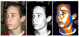 Students used a photograph of themselves, used Photoshop to analyze the basic facets on their faces, then chose their own colors to blow it up to a 14X20 poster. Nick tried his hardest to look like President Obama in his pose, and chose the complimentary colors, orange and blue to try to make as striking an image as he could.
 Graphic Artist, Shepherd Fairey used an AP photo by Michael Garcia to create his famous campaign poster of Barrack Obama. His original now hangs in the National Portrait Gallery
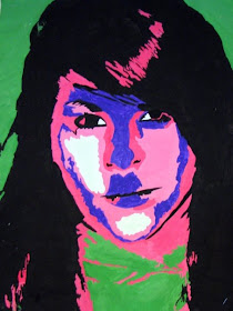 Victoria's pose and color choices, make this look like one of 60's Pop Artist Andy Warhol's portraits of Hollywood stars. She received a Judge's Choice ribbon for this painting at the first annual Western Valley Conference Art Show March 20-2 hosted by West Monona HS in Onawa.
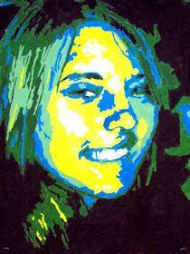 Nisha's analogous color scheme (next to each other on the color wheel) make it look like she's deep in the ocean
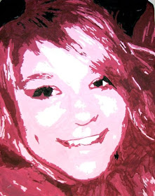 Christine's monochromatic (one color in different shades) almost looks like a photograph in maroon, red, and pink
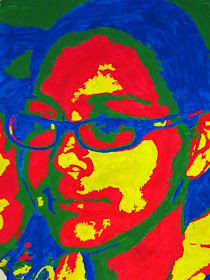 Rosario's color choices make this look like an actual thermal scan using an infrared imaging divice
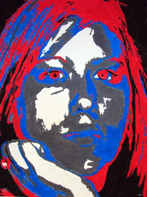 Billie used the same patriotic colors as our exemplar, Shepherd Fairey. It really intensifies her eyes.
 Megan used only the primary colors (red, blue, and yellow) making this a very striking composition
 Luke's striking yellow background and limiting himself to just four shades, really makes this look like a comic book image
Wednesday, April 22, 2009
Photo Websites
Photo Websites
Some of these are options for ordering prints, some offer online storage and sharing, some are social networking communities.
• http://flickr.com Flicker
• http://www.mpix.com Mpix
• http://photobucket.com Photo Bucket
• http://psc.photoshelter.com Photo Shelter
• http://photo.net photo.net
• http://picasaweb.google.com/home Picassa
• http://www2.snapfish.com/home Snapfish
• http://www.walmart.com/photo-center Wal-Mart Photo
• http://winkflash.com Winkflash
• http://pg.photos.yahoo.com Yahoo Photos
• http://target.com/photocenter Target Photo Center
• http://www.KodakGallery.com Kodak Photo Gallery
• http://photo.walgreens.com Walgreens Photo Center
• http://cooliris.com Cool Iris is plugin for your web browser for viewing pictures and videos
• http://www.picnik.com PicNik is an online editing tool with easy to use yet powerful editing tools. Tweak to your heart's content, then get creative with oodles of effects
• http://www.gimp.org GIMP is the GNU Image Manipulation Program. It is a freely distributed piece of software for such tasks as photo retouching, image composition and image authoring. It is a FREE download for people who can’t afford PhotoShop but want more control that picnik
Thursday, March 5, 2009
Sub lessons
PER 4- MS Art I will have gotten students started on their value-puzzle portraits. They need to draw as silently as they can, one square at a time, only looking at them upside down. They may use graphite sticks, blending sticks and Kleenex for blending. Please also make sure that they read silently during DEAR time.
PER 5- Painting Students have already received directions for three color exercises in their watercolor pads. Examples are hung on the whiteboard. Most students will be working on the second of three. Those students who finish all three may "free paint." Clean-up is important the last 5 minutes of class.
PER 6- Yearbook Mandi, Danielle, and Christine may work on layouts on www.yearbookavenue.com in the Graphics Lab. The rest of the students have a quiz ( I will leave it on the island counter). They may use their notes, but not their book or worksheets. When they turn in their finished quiz, please return their previous quiz (also on the counter). They have a headline writing assignment that they may work on in groups quietly once they're done with their quiz. It is due at the end of the class period- please collect it. (Kelsey & Cortney have already finished it so they may use the time as a study hall.)
Saturday, January 31, 2009
Remembering Mrs. Weber
She was the kind of a teacher whom those of us who go into teaching aspire to be like.
Our colleges and administrators and the state dept. of Ed and AEA consultants are constantly telling us that we need to maintain both rigor and relevance. Honestly I wonder sometimes how any teacher can possibly provide both. Teachers with rigorous standards often frighten or discourage students and teachers who bring learning alive by providing practical and meaningful relevance sometimes let kids get by with too much (or too little).
Susan was someone who somehow struck the perfect balance. I never knew a student who thought her classes were easy, but I at the same time, I don't remember ever hearing a single student say an ill word about her. On the contrary, I don't know of another teacher in our district and few elsewhere of whom so many students spoke with such admiration, appreciation and affection.
Just today a former student shared with me how much Susan Weber had challenged them, and at the same time encouraged them. They told me without a doubt that they would not be where they are today if it weren't for Susan.
She was truly gifted and she constantly and generously shared those gifts with others. What a gift we've all lost in her now that she is gone. Yet because she touched so many lives, her influence will be felt for generations.
Friday, January 30, 2009
In Memory

This morning we were told that Boyer Valley's U.S. History teacher, Susan Weber passed away last night. She had been admitted to the hospital last week due to complications from her chemotherapy treatments for Lukemia.
We don't know when the funeral will be yet, but it may be Monday or Tuesday of next week. There was even talk of having it here at school. Please keep her mom, Wanda, and all of her students, friends and colleagues in your prayers.
Susan was a consummate professional who know her stuff and dearly loved her students. She and I enjoyed having long talks about history and politics. I've already missed her all this year while she was on her medical leave of absence. She is irreplaceable. Boyer Valley is truly an emptier place this morning.
Wednesday, January 28, 2009
Theme Spin Offs
| "Characters Welcome" | ||
| Section | Dirrect Spin-Off | Indirect Spin-Off |
| Elementary | Cartoon Characters | Rugrats, Backyardigans |
| MS | Character Development | Immaturity |
| MS Sports | Character Education | Heaveyweights, True Life, Comebacks |
| HS | A range of characters | Confessoins of a teenaged Drama Queen, Secret Life of the American Teenager |
| Summer Sports | Welcome to the big leagues | |
| Fall Sports | Friday Night Lights | |
| Winter Sports | Benchwarmers, Air Bud | |
| Spring Sports | It builds character | Juno |
| Activities | Welcome to the Carribean | Jack Sparrow |
| Fine Arts | Ramona, Step Up | |
| Clubs | Your Welcomed | Bill Nye the Science Guy, Cash Cab |
| Seniors | Welcome to the Real World | |
| Ads | Solicitors Welcome | |
Thursday, January 15, 2009
Painting; Color theory
To learn more, visit http://en.wikipedia.org/wiki/Pastel_colors
Aesthetic Scanning: Another Way to Look at a Photograph
1. Sensory qualities refer to the art elements including -- line, shape, texture, color, space, value.
2. Formal qualities refer to the principles artists, designers, and photographers use to help compose their images and manipulate the viewer’s attention – balance, unity, emphasis, contrast, rhythm, variety, proportions.
3. Expressive qualities refer to meaning, use of symbol, feelings they evoke, memories they invoke, or reactions they provoke etc.
4. Technical qualities refer to the method and use of materials-- lighting, density, focus, field of vision, depth of field, lens, ISO settings & film speed, etc.
5. Judgmental qualities refer to the viewer's sense of the value of the work – after considering the previous five steps, what criteria do you use to evaluate the impact or importance and how well does this image measure up to those standards?
Tuesday, January 13, 2009
Painting quiz Jan 16 TERMS
- Les Caux Cave Paintings
- Egyptian painting
- Greco/Roman painting
- Medieval painting
- Heronimous Bosch
- Duccio
- Icons
- Book of Kells
- Mattias Grunwald
- Media/medium
- elements of design;
- line
- shape
- space
- value
- texture
- color;
- Spectrum
- Primary colors
- Secondary colors
- Intermediate/tertiary colors
- Complimentary colors
- Chroma/saturation
- Tints
- Tones
- Simultaneous contrast
- Neutralizing
- Warm colors
- Cool colors
- Triads
- Analogous color families
- Monochromatic
Quiz Friday Jan 16 TERMS
- Ansel Adams
- Alfred Stieglitz
- Lens
- Aperture
- Shutter
- Viewfinder
- Film speed
- depress the shutter release part way/Automatic focusing
- Image sensor
- USB connection
- LCD monitor
- SLR
- DSLR
- Viewfinder cameras
- Prosumer
Photographer notes; Alfred Stieglitz

"Photography is not an art. Neither is painting not sculpture, literature or music. They are only different media for the individual to express his aesthetic feelings… You do not have to be a painter or a sculptor to be an artist. You may be a shoemaker. You may be creative as such. And if so you are a greater artist than the majority of the painters whose work is shown in the art galleries of today."
Alfred Stieglitz, 1864-1946
American
- Important because he made photography an accepted art form
- Best known for strong compositions, skies citiscapes or subjects nearly abstracted, capturing moments to tell a story with a photograph (photojournalism)
- Editor/Publisher of Camera Work magazine (1903-1917)
- 'Gallery 291' in New York
- "star maker" for photographers, writers, and painters
- Had an affair with, and in 1924 married painter Georgia O'Keefe, whom he photographed extensively (see above),


