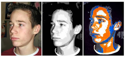
Students used a photograph of themselves, used Photoshop to analyze the basic facets on their faces, then chose their own colors to blow it up to a 14X20 poster. Nick tried his hardest to look like President Obama in his pose, and chose the complimentary colors, orange and blue to try to make as striking an image as he could.
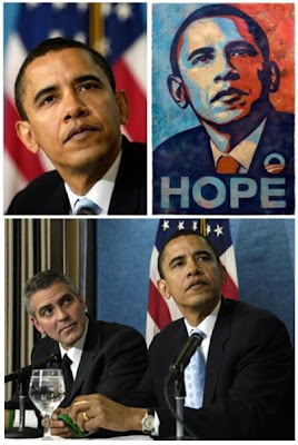
Graphic Artist, Shepherd Fairey used an AP photo by Michael Garcia to create his famous campaign poster of Barrack Obama. His original now hangs in the National Portrait Gallery
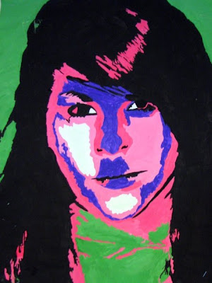
Victoria's pose and color choices, make this look like one of 60's Pop Artist Andy Warhol's portraits of Hollywood stars. She received a Judge's Choice ribbon for this painting at the first annual Western Valley Conference Art Show March 20-2 hosted by West Monona HS in Onawa.
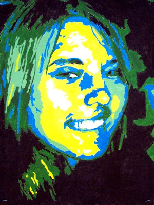
Nisha's analogous color scheme (next to each other on the color wheel) make it look like she's deep in the ocean
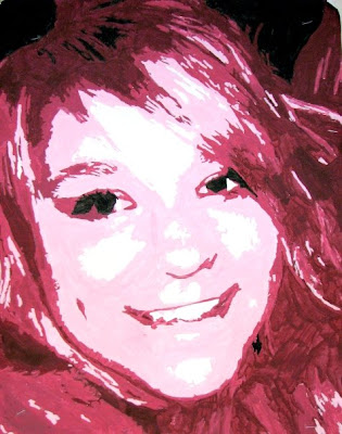
Christine's monochromatic (one color in different shades) almost looks like a photograph in maroon, red, and pink
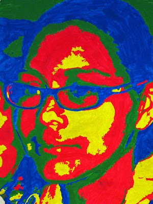
Rosario's color choices make this look like an actual thermal scan using an infrared imaging divice
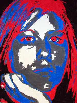
Billie used the same patriotic colors as our exemplar, Shepherd Fairey. It really intensifies her eyes.
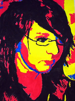
Megan used only the primary colors (red, blue, and yellow) making this a very striking composition
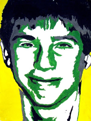
Luke's striking yellow background and limiting himself to just four shades, really makes this look like a comic book image
 Students used a photograph of themselves, used Photoshop to analyze the basic facets on their faces, then chose their own colors to blow it up to a 14X20 poster. Nick tried his hardest to look like President Obama in his pose, and chose the complimentary colors, orange and blue to try to make as striking an image as he could.
 Graphic Artist, Shepherd Fairey used an AP photo by Michael Garcia to create his famous campaign poster of Barrack Obama. His original now hangs in the National Portrait Gallery
 Victoria's pose and color choices, make this look like one of 60's Pop Artist Andy Warhol's portraits of Hollywood stars. She received a Judge's Choice ribbon for this painting at the first annual Western Valley Conference Art Show March 20-2 hosted by West Monona HS in Onawa.
 Nisha's analogous color scheme (next to each other on the color wheel) make it look like she's deep in the ocean
 Christine's monochromatic (one color in different shades) almost looks like a photograph in maroon, red, and pink
 Rosario's color choices make this look like an actual thermal scan using an infrared imaging divice
 Billie used the same patriotic colors as our exemplar, Shepherd Fairey. It really intensifies her eyes.
 Megan used only the primary colors (red, blue, and yellow) making this a very striking composition
 Luke's striking yellow background and limiting himself to just four shades, really makes this look like a comic book image


 follow me on facebook

No comments:
Post a Comment